Also known as chartreuse, the color yellow-green lies between green and yellow in the color wheel. This tertiary color is comprised of precisely 50% green and 50% yellow. However, other variations of these mixtures result in sub-categories of the color green. Such as, chartreuse green, chartreuse yellow, pear, yellow-green and green-yellow. When taking a look at the HSV Color Scale (learn more about HSV), yellow-green can be defined by a hue range from 61° to 80°.
Source: w-enter.comUltramarine blue and lemon yellow, physically mixed.
What does yellow-green represent?
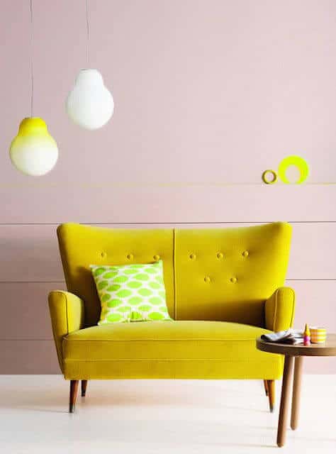
The tertiary color yellow-green is most commonly perceived to be an exciting and vibrant shade, evoking feelings of joy and cheeriness. Chartreuse represents enthusiasm, happiness, nature, growth, and youth. Like standard green, chartreuse is associated with the liveliness and the blossoming of spring. However, in contrast it can also stand for sickness, jealousy, and cowardice.
On the light spectrum
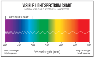
Yellow-green is close to thebrightest color of the visible spectrum with a wavelength ranging between 530-580 nm.
Yellow-green is the color between yellow and green on the spectrum of visible light.
History
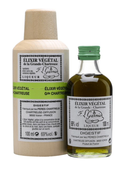
The color was named after a French liqueur called “chartreuse” which has a greenish-yellow hue. The liqueur was first produced in 1605 by the Carthusian monks of France, but likely not marketed to the public until the 1730s.
Chartreuse revived by the Carthusian monks in the 18th century
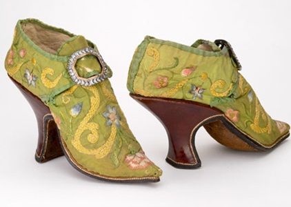
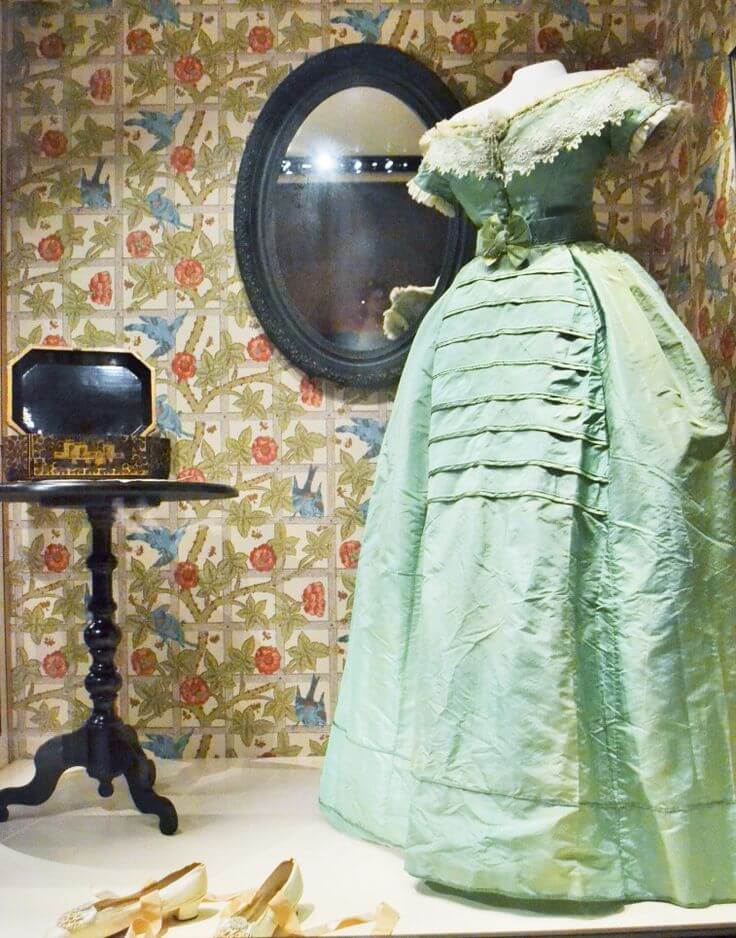
In 1884, the name of this drink was first used as a color name when it was mentioned in a British fashion newspaper until. By the late 1800’s both silk and velvet fabrics were being produced in the color chartreuse and used to create stylish accessories including feather fans, gowns, purses, shoes, and hats.
Chartreuse colored accessories from the 1800s
In the 1920s, chartreuse was a very popular choice for dresses because of its bold and rebellious nature. Chartreuse resurged in the late 1950s as a common color choice for clothing and furniture. In the 1960’s, its boldness appealed to young people. Yellow-green began to be used in both psychedelic color-schemes and nature-oriented palettes. Famous fashion designers began incorporating chartreuse heavily into their creations. Although the color fell out of favor in the 1970s, it made a comeback in the late 1980s. By the 2000s, chartreuse became favored as a decorative color in offices of tech companies. This is because it is believed to be a reflection of individuality and creative thinking.
Where do yellow-green pigments originate from?
Sheele’s Green
The yellow-green pigment Sheele’s Green was a highly toxic cupric hydrogen arsenite discovered in Sweden in 1775 by Carl W. Scheele, a German chemist. The color is bright, warm yellowish-green with good opacity. Despite the dangers, the unique color was made into paintings, candles, wallpaper, and even children’s toys.
Victorians were obsessed with achieving the perfect shade of green. As a result, unfortunate horror stories in the 19th century include stories of women in green dresses passing out and those using it to print newspapers suffering from the detrimental effects.
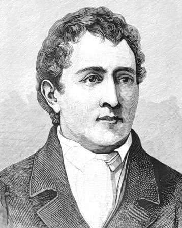
Chemist Carl Scheele invented the first colorfast green dye in 1778 by combining poisonous arsenicAmounts of arsenic that were deadly to children and the elderly were easily metabolized by healthy adults
Yellow-green Studies
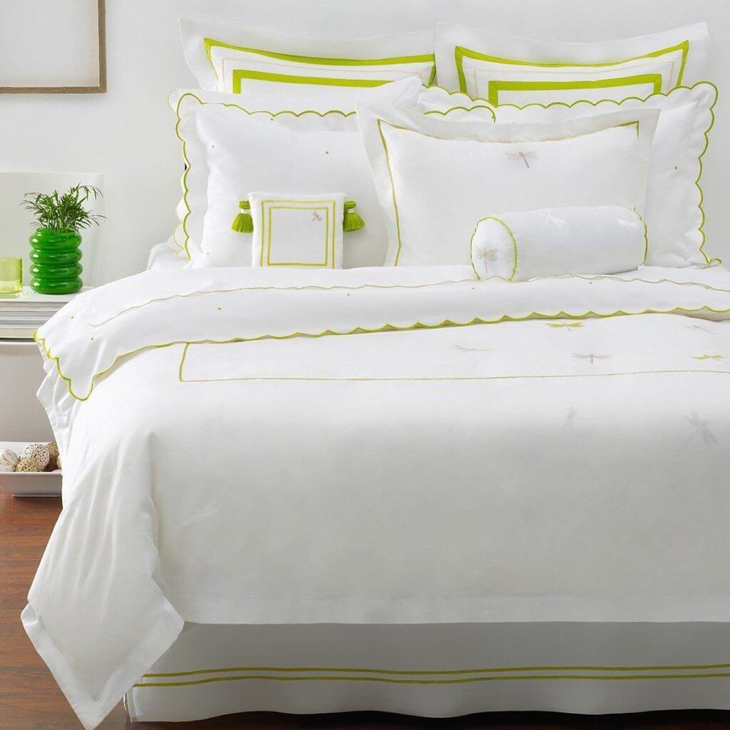
Samantha Schoech, writes a guide on how to work with chartreuse. She states that in its lighter, softer form chartreuse makes a great wall color for earthy, nature-inspired rooms.
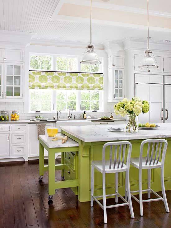
However, in its boldest, brightest form it is as eye catching as neon. Chartreuse can be both earthy and electric. It looks wonderful with reds, oranges and blues, especially turquoise and cobalt.
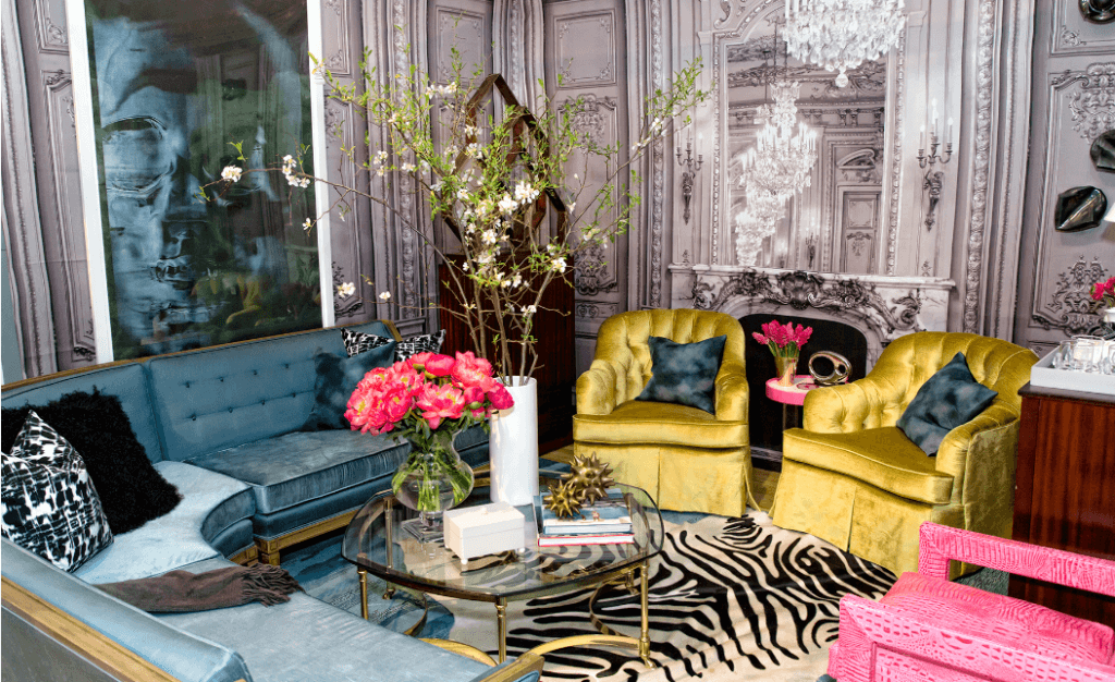
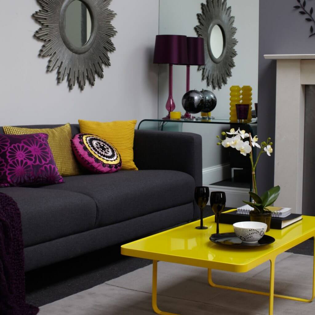
Bright chartreuse is a perfect foil for charcoal gray and in modern design is often used as a pop against muted neutrals. It looks crisp and spring-y with bright white and vivid with purple (Source).
Now share your color themed pictures with us to feature on our future Color Columnposts! Tag us on @nixsensor and use #nixplore #nixcolorcolumn on your pictures.