It’s finally time to say hello to spring! Get your home ready for this fresh new season simply by adding color. We’ve included 6 color schemes that will inspire you to spruce up your space – all paint colors found in the Nix Paints App:
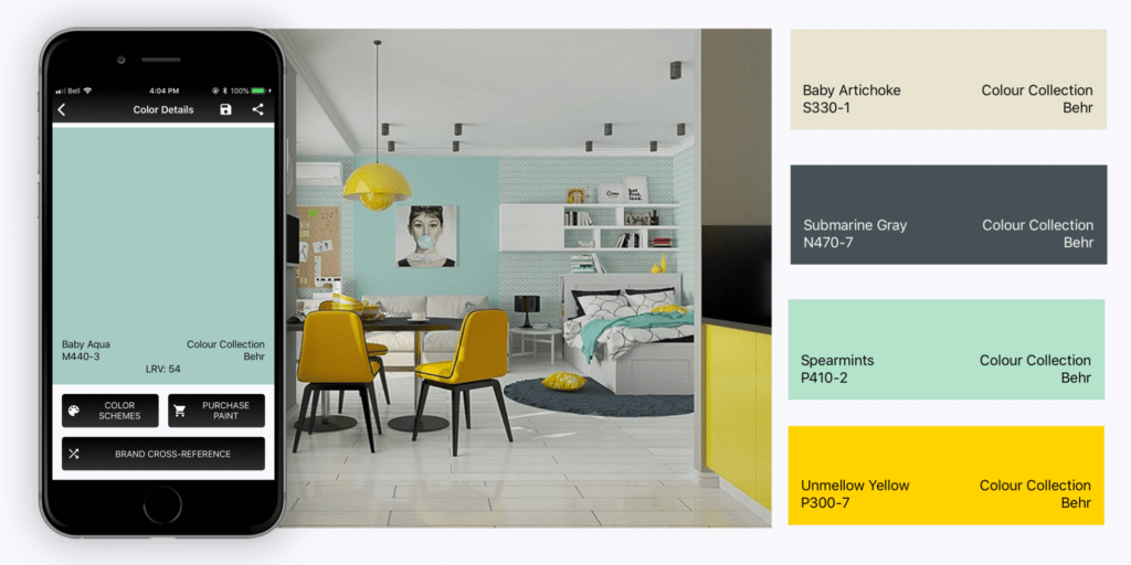
Idea #1 Yellow, White + Green
Choose colors by sticking with those which appear together in nature. One classic color combination suggestive of springtime is vibrant yellow, green and crisp white. The yellow tones are commonly found in fruits and flowers, and the saturated green can be seen in lush foliage. White is a perfect neutral which helps mediate the intensity of the other two bold colors.
PAINT SUGGESTIONS: Bright Yellow 2022-30, Gardenia AF-10, Sweet Pea 2031-30, Citrus Green 2032-40, In the Midnight Hour 1666
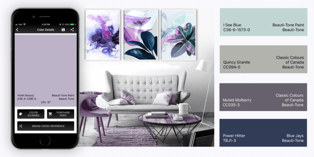
Idea #2 Violet + Baby Blue
Robin’s egg blue or baby blue is one of the most iconic colors associated with springtime. Robin’s egg blue can take on an entirely new personality when partnered with something unexpected, like purple. For the perfect contrast, consider combining Robin’s egg blue with deep shades of violet.
PAINT SUGGESTIONS: Violet Beauty A38-4-1296-0, I See Blue C36-6-1578-0, Quincy Granite CC094-0, Muted Mulberry CC035-3, Power Hitter TBJ1-3
Idea #3 Lemon Yellow + Mint Green
Lemon yellow is a springtime staple commonly seen in tulips, daffodils and daisies. An excellent color to pair with lemon is mint green. While yellow on walls and furniture may become overpowering, mint is a calm, soothing color which works beautifully on walls, ceilings and upholstery. Balancing the overpowering vibrancy of lemon yellow.
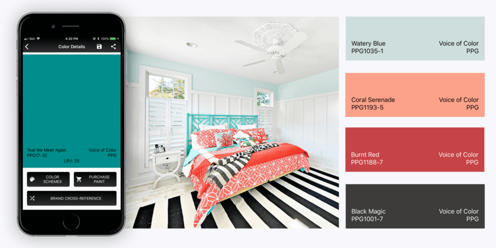
Teal is traditionally a color seen in summer; however, by mixing it with feminine tones, this blue-green hue can instantly take on a springtime personality. Coral is the perfect mix of pink and orange but can overwhelm a space with its saturation. To use teal and coral effectively, stick with teal as the dominant color and coral as its accent.
PAINT SUGGESTIONS: Teal We Meet Again PPG17-32, Watery Blue PPG1035-1, Coral Serenade PPG1193-5, Burnt Red PPG 1188-7, Black Magic PPG1001-7
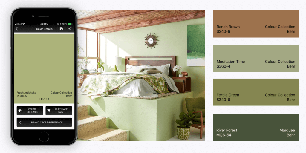
Idea #5 Monochromatic Muted Greens
Monochromatic color schemes are best for giving rooms a well-layered vibe. To layer spring into a space, consider using sage, pistachio and mint green tones together.
PAINT SUGGESTIONS: Fresh Artichoke M340-5, Ranch Brown S240-6, Meditation Time S360-4, Fertile Green S340-6, River Forest MQ6-54
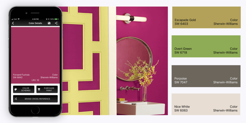
Idea #6 Fuchsia + Soft Green
While celery green tends to work well with adult spaces, raspberry often feels youthful. To pair these colors together successfully, use raspberry or a fuchsia color alongside a toned down green to bring a springtime feel to the space.